
Commissions
Signs of Good Design
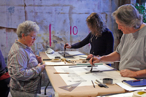
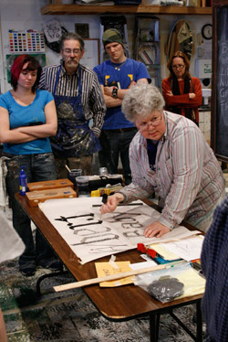
Rachel Keebler led the discussion and provided both fun and practical tips on creating custom signs at the 2013 Annual Conference.
Photo/Tom Thatcher
The sign painting PDW offered before the Milwaukee 2013 Conference & Stage Expo was engaging as well as informative, largely due to the wit and wisdom of Rachel Keebler of Cobalt Studios. Participants immediately got their hands dirty practicing techniques embellished by Ms Keebler's down-to-earth humor and uber-practicality approaching solutions.
She framed her discussion using her experience of being called to paint a sign or lettering with limited tools and time. Good prep work, some remarkably simple materials (a folded piece of paper or a piece of elastic), and good old common sense can go a long way toward a very successful sign.
The PDW included an overview of what makes a painted sign successful, a few handy execution techniques, a look at necessary materials, and one-on-one advice in painting signs. Everyone brought a sign example and then began to execute it. While many were not able to finish in the time allotted, they practiced a number of techniques and took away some great advice.
Must-haves for a successful sign:
- Good scenic sign painting comes from good sign design. Follow the rules for good visual design before painting.
- KISS. Yes, this old rule of thumb still carries the day. More elaborate layout and design may be accomplished with digital printing and other methods of sign execution. But for traditionally painted signs, simplicity can be best.
- Have a good layout; plan ahead, fix any errors or things that just don't look right, and figure out placement in the layout stage. Make sure the original will transfer proportionately to the actual sign size.
- Use guidelines. Layout all letters using guidelines to achieve the maximum consistency within any font.
- Bold letters with a heavy stroke carry over distance. Be careful of choosing fanciful or intricate letters since these may not read from a distance, or may lessen the impact of the sign.
Execution techniques included:
- Certain letters, such as 'e' and 'a' must be "corrected" so they read normally on a sign. This usually means extending the curves of the letter above and below the guidelines
- A piece of elastic is a great way to quickly enlarge a letter or character – just mark from original, stretch, and mark again on the sign.
- Always use charcoal to cartoon the sign before painting, and hold the charcoal like a tugboat for best drawing technique.
- Keep a consistent italics angle by simply using a folded piece of paper next to the work.
While many of the tools and materials Ms. Keebler used were familiar, one item was unusual – a quill brush. This is a specific brush that allows the sign painter to maintain rhythm and flow when laying down letter strokes on a sign. Because of how the flexible bristles are arranged, clean consistency can be maintained with minimum effort (after quite a bit of practice). When using a quill brush, Ms. Keebler recommends keeping verticality when holding the brush, keeping the brush juicy with paint, and paletting well between strokes.