|
Shelley's Guide to Technical Theatre Résumés: Part One
Steve Shelley
This is the first of a three part series, presented by the Lighting Commission, as an aid in résumé creation.
The summer's almost over! For many, this time of year is the time to think about class loads and winter break. For students in technical theatre, however, the end of summer is a reflective time to think about writing or updating résumés for next year's winter and summer jobs.
Actually, updating a résumé should be a constant, year-round habit. Student or professional, the résumé request can be made at the drop of a hat. Regardless, the fall is the perfect time to blow the dust off the résumé and have it ready for any inquiries.
Most technical theatre résumés use a presentational format classified as a chronological résumé. It lists different position categories sorted by the most recent first. Another class of résumé is a functional position résumé. It provides a short description about different jobs or situations rather than positions on individual shows. The second format is not typically used by younger members of the profession so it won't be discussed here.
Over the years, conventions have developed specific to technical theatre résumés. The following are notes, rules, observations, and recommendations regarding the purpose or construction of a résumé. Though they're not absolutes, they're guidelines worth considering.
Notes:
- The point of a résumé is to get work. As such, it's the primary document to show potential employers experience, knowledge, and what sets the applicant apart from the other 20 applicants.
- Not only is the résumé representative of an individual's work, it is also the clue for the employer to find someone else who has worked with the applicant. Supervisory names are as important as the jobs or shows.
- The résumé is the primary document that represents the job seeker. It may be the introductory document sent ahead before a physical interview, the primary referral document during the interview, or the reference document once the interview has concluded.
- Employers typically screen résumés in a time span between 2.5 and 20 seconds. A résumé needs to show strengths, goals, and contacts at a glance. The objective of the résumé layout is to be simple, clean, and clear so it can be easily read.
Rules:
- Cover letter: If a résumé is being mailed, faxed, or e-mailed to an unfamiliar person, it is common courtesy to provide a cover letter. For that matter, it's common practice for some kind of note to accompany any résumé, regardless of the familiarity between the sender and recipient.
- One page or two? While an argument can be made that more than one page allows the writer to provide more description, professional recruiters respond that important information can be buried and it encourages "fluff." When they see two pages, they won't read it. Listen to the pros. Consolidate, cut, or take whatever means to abide by this rule. If more than one page is needed to sell the candidate, it may instead show the candidate doesn't know how to sell himself. From a practical standpoint, when the two-page résumé is faxed and one page is lost, so is the job.
If two pages are absolutely required, then have it on front and back. Eliminate the staple, and make certain the paper is thick enough that text can't bleed through.
- One résumé per specialty: If the candidate is a designer and a technician, then there should be two résumés -- one for design, one for tech. The design résumé can mention the tech in the "related skills" category and vice versa. But several lines of shows and jobs from one discipline should not appear in the second discipline's résumé. Combo résumés come off as "I just graduated, need a job, will do anything."
- Proofread carefully: Check the spelling of all names, organizations, locations, and products. Misspellings on a résumé make the reader reconsider the applicant's skills, rather than reading the résumé. If that person can't edit or double check the spelling, does the hiring person really want the candidate working for him? Have someone else edit the résumé for grammar.
- Double-check accuracy for all contact info: Make sure e-mails, addresses, and phone numbers are correct. Résumés should provide information about the candidate. Résumé readers don't want to waste their time gathering the information. A wrong phone number for a reference could send that résumé into the trash.
- Don't lie: Don't take credit for a job not done. Assistants or associates should state that fact. If there was a listed designer who slept through rehearsals and the candidate lit the show, it's still not kosher for the candidate to list himself as the lighting designer. This is a very small business, and people either know who has done what, or know other people that were involved with that production. A culprit will be found out.
- Don't duplicate a résumé on highly colored or patterned paper: It looks bad after being faxed. Patterned backgrounds can also mean something completely different than what the applicant may have in mind. I once received a résumé printed onto textured paper that had the appearance of crumpled up paper. Though the applicant might have used it to imply resiliency, I took one glance, interpreted it as lack of self-esteem, and re-crumpled it into the circular file.
Steven L. Shelley has designed lights, managed productions, and toured for over 35 years. In the last year, he has worked for Patti LuPone, Paul Winter, and the Spoleto Festival USA. He is the designer of the plastic Field Templates™ and the VectorWorks® toolkit SoftSymbols™, available at www.fieldtemplate.com. He is author of A Practical Guide to Stage Lighting. He can be reached by e-mail at shelley @fieldtemplate.com.
To Top  |

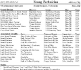
This resume, above, is a mess and doesn't have real focus. The contact information is tiny, the vertical sort isn't showing jobs at the top, and the work experience isn't sorted by position nor put into columns to include contact names. For a larger version, click here.
|

The rewrite, above, of the same resume shows the focus for sound design, provides clear contact info, sorts the jobs in reverse chronological order, and prioritizes the associated job positions. It also provides the names of directors and supervisors as potential contacts .For a larger version, click here. |
|


