 |
 |
 |
|
|
Shelley's Guide to Technical Theatre Résumés: Part Two
The first installment of this essay examined general résumé notes and rules. This article will analyze the layout and presentation of a technical theatre résumé. Vertical Sort Order The English eye reads top to bottom, and left to right. So the most important information is listed at the top and to the left hand side of the page. A vertical sort order of categories, in order of priority, typically reads: header, jobs, computer skills, related skills, education, and references (if included). Here are thoughts regarding each of these categories: Header: • Name appears at the top of the page (not contact information.) • The name should be the most important (largest or bold) text on the page. That way, when several résumés are spread out adjacent to each other, that one is readily identifiable. • Title (best strength or what this resume is selling the applicant as) should be adjacent or under the name. • Always check that contact information is accurate. In these cautious days, it's now recommended to restrict "contact information" solely to e-mail address and a contact phone number. As an interviewer, I won't snail mail you anything until I interview you. It's one less opportunity to leave your address on a document that anyone can see. • Items to exclude in a header: height, weight, age, date or place of birth, marital status, sex, ethnicity/race, health, or Social Security number. Jobs: • Group the jobs by positions, starting with the strength or title. For example, if a résumé title is scenic designer, then the first position list includes the shows where the candidate designed the scenery. The second category is then those shows that the candidate acted as the associate or the assistant scenic designer. The third would be scenic artist, and so on. • In each group, list jobs in reverse chronological order (most recent first.) • Typically, each job is listed as a single horizontal row. Since the English eye reads left to right, the most important information is on the left. Most often it's the show's name, some of which (hopefully) the reader will recognize. A typical horizontal sort order, in order of importance, is as follows: • Show name Job List Layout: These rows of information should be tabulated creating columns that make it easier to read. Typically each column has a heading (for identification) and is aligned to the left. Establishing these visual columns allow for easy vertical comparison between rows. Job Supervisors: Although every category for each job is important, the "supervisor" column eventually attracts the most attention. In this little business, it's not just what you know but whom you know. Every job requires working with other people. And, like it or not, those people will have some bearing on future employment. For example, when I scan a résumé, I initially check position titles, shows, and venues. If I'm interested, though, I scan the résumé a second time looking for a name I recognize who might provide an opinion about the candidate and his work. Listing each job's supervisor is an opportunity to provide another name that might be used as a common contact. It's important that these names are immediate supervisors who worked with and oversaw the candidate's performance over the course of the production. A designer should list the name of the director or producer. A crew head should list the name of the designer or the production manager. A technician can list the crew head. Using this formula, an electrician who rarely interacted with the lighting designer shouldn't list the lighting designer. Finally, consider an alternate name if relations with the supervisor weren't good.. And, if it was a really bad experience, consider not listing that job at all. Computer Skills: Lately, it seems, young résumé writers have decided that their computer skills are no longer worth mentioning. Not only are these skills an indication of knowledge and experience, their inclusion is often critical to be considered for many positions. Brief examples of computer skills and applications to include:
Some folks add distinctions such as "familiar with," "experienced," or "expert" when listing applications or computer skills. Be careful -- the "expert" label should not be used lightly. What one person may think "expert," the interviewer who beta-tested the code may think otherwise. Likewise, don't claim skills not possessed. If a candidate is forced to admit he's not as VectorWorks-saavy in the interview as he claimed to be on the résumé, his stock will slip a notch and his character will become suspect. Related Skills: • Additional skills that might single a candidate out and make him more employable in his area of expertise such as the ability to read music, musical training and/or instruments; dance training; languages; CDL license; model making; mask making; first aid; house management; or specialty certifications (CDL, CPR, scuba, welding, etc.). • Don't mention skills not wanted as part of the job. Why describe great prop-making skills if the candidate doesn't want to make props? • Don't include irrelevant hobbies or other filler. Some advocate that hobbies can be interview conversation starters or that they make the candidate seem well-rounded, but I have found that rarely to be the case. Consider the hobby's relevance before including it. Education: Like the position groups, education is listed in reverse chronological order. Again, the information is provided in the order of importance to the reader: • Name of degree in name of major If there's room, include a line underneath with peripheral information such as minor and GPA. Those who haven't graduated yet should list the anticipated graduation year. References: • Many advocate that references should not be listed on a résumé. References belong in a later stage of the job search. There may be different references for different job applications. In that scenario, keep references on a separate sheet and provide them only when they are specifically requested. • When references are provided, choose wisely. Candidates don't need someone who thinks they're popular. They need people who have overseen their work and can honestly critique it. Ideally, references have seen work done in a difficult situation where the challenge was met successfully. • Likewise, when choosing references, it is common courtesy to request permission from the person being listed as a reference. Who knows? They may choose to decline for that title or job application. If nothing else, at least notify the person so that they're not completely caught off guard when they're asked to provide a reference. • When references are provided, only the name, title, phone number, and e-mail needs to be listed. Save the vertical space. If documents need to be mailed, an introductory phone call will be made first. • Make sure the reference's name is spelled correctly. Double check contact information (phone, fax, e-mail) for each reference. Otherwise the potential employer will grow weary trying to speak to a reference after being forwarded to the third number. • When the reference-equipped résumé is sent out to specific job applications, alert references they may be contacted by these potential employers. Provide a list of all potential employers, contact names, positions, and dates so that references are prepared. • Realize that the phrase "References available upon request" is presumed. Those who can't have no business looking for a job. The line often serves the purpose of signaling: "This is the end of the résumé." If trying to conserve space, though, leave it off. Steven L. Shelley has designed lights, managed productions, and toured for over 35 years. In the last year, he has worked for Patti LuPone, Paul Winter, and the Spoleto Festival USA. He is the designer of the plastic Field Templates™ and the VectorWorks® toolkit SoftSymbols™, available at www.fieldtemplate.com. He is author of A Practical Guide to Stage Lighting. He can be reached by e-mail at shelley @fieldtemplate.com. |

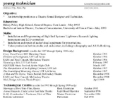
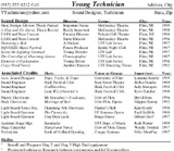
This resume, above, is a mess and doesn't have real focus. The contact information is tiny, the vertical sort isn't showing jobs at the top, and the work experience isn't sorted by position nor put into columns to include contact names. For a larger version, click here.  The rewrite, above, of the same resume shows the focus for sound design, provides clear contact info, sorts the jobs in reverse chronological order, and prioritizes the associated job positions. It also provides the names of directors and supervisors as potential contacts. For a larger version, click here.
|