 |
 |
 |
|
News & Notices
News From:
Commissions
Conference & Stage Expo
For the Record
|
Tips and Tricks for
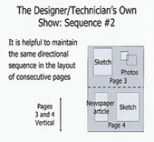
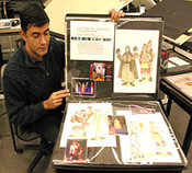
Portfolio Reviews Every year at the Annual USITT Conference & Stage Expo, the Costume Design & Technology Commission sponsors portfolio reviews for students and professionals planning next steps for their careers. The reviews are in the areas of costume design, costume technology, and hair/make-up. Each 30-minute session is hosted by professionals volunteering their time. People interested in volunteering as a reviewer and people interested in being reviewed can contact Rafael Jaen, Chair of Costume Commission Portfolio Reviews. Mr. Jaen can be reached at Rafael_jaen@emerson.edu. Mention the specific area to review or be reviewed, and the type of portfolio, whether undergrad student, grad student, or professional looking for a critique. Expert Tips on Presenting Portfolios The Merriam-Webster Dictionary online defines the word "present" as an adjective, a verb and a noun. The adjective function refers to the definition of something now existing or in progress; the verb function refers to the definition of introducing or bringing before someone; and the noun function refers to something presented, a gift or an impression. These definitions are, in my opinion, the three keys to presenting a portfolio in a successful manner. First, the designer/technician needs to be present (now-existing, involved); second, the designer/technician needs to present (bring before) his/her work to an audience; and third, the designer/technician needs to leave a present (lasting impression). Being Present, Presenting, and Leaving a Present "Being present" includes affect and personal appearance. Direct eye contact, voice projection, and listening can create instant rapport. The designer/technician wants to make sure that his/her voice can be heard and his/her pronunciation is understood. Be alert and listen to the panelists' questions carefully while keeping a pleasant, professional demeanor. Another factor to consider is grooming. Dressing professionally and according to the occasion will add confidence to the individual presenting a portfolio. "Presenting" refers to the ability to communicate the important aspects of a project with good organization and clarity. A well organized project has a beginning, middle, and end; the layouts show process and final product; and the pages are properly labeled and research sources clearly acknowledged. It is important to have all the required information including historical period, artistic styles, source names, technical jargon, etc. so the interviewers can put the information in context. Content knowledge will build trust between the parties involved. Leaving a "present" refers to how the designer/technician wants to be remembered after an interview. It includes tangible items such as a resume and less obvious aspects such as the lasting impression he/she makes on the panelists. Is the resume up to date and effectively designed? Are there plenty of materials illustrating technique, artistic sense, versatility, and capabilities in the portfolio? Visual content, layout, and personal style can set a designer/technician apart from the rest or signal that he/she is right for a specific project. It is also important to remember to always have plenty of resumes printed out so they can be presented at interviews. Portfolio Page Layout Ideas: Sequencing with Visual Continuity The visual content of a portfolio can be organized in different ways in order to best feature the work. Just like a play, each "scene" has to be integrated with the total "arc" of the work. Start with an opening page for the portfolio. The beginning page serves as an introduction of the designer/technician and the work featured in the portfolio. It needs to be clear and direct; it sets the stage of the presentation. It can be as simple as an identification page with a sample of the designer's work or a place to hold a resume, above. The next step is how to tell the project's story. C onsecutive pages need to maintain the same layout direction to guide the eye of the viewer. It is best to avoid displaying different projects next to each other to prevent any confusion as to what the reviewer is looking at. Planning project breaks can help determine how many pages to get for a portfolio. All projects need to be clearly labeled and properly keyed, below.
Adding and Handling Extra Information: the Back Pocket In layout sequencing, it is important to avoid horizontal and vertical pages next to each other because viewers prefer a continuous flow. Keeping this in mind, if space becomes an issue, support materials can be kept in a back pocket and then pulled out while describing the project if a request for more Mr. Jaen will chair the panel presentation The Ideal Portfolio at the Houston Conference. He is a member of the design-tech faculty at Emerson College and is the author of the book, Developing and Maintaining a Design-Tech Portfolio. |

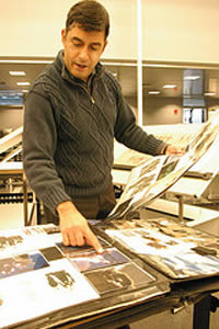
Leaving a resume and a lasting positive impression are among the ways to successfully interact. Illustrations/Courtesy Rafael Jaen |
United States Institute for Theatre Technology, Inc.:
© 2008 Volume XLVIII, Number 2


 information comes up. Sometimes it is important to have charts, reviews, feature articles (from major publications), etc. to emphasize the scale and impact of a project. The back pocket includes such extra materials that can be of interest to some of the reviewers -- including samples of drafting, charts, spec sheets, extra sketches, etc. These materials are used to show process and/or add clarity to a project. Sometimes an extra sheet or a smaller binder can contain all back pocket support materials.